I apologize for not posting on the Wall for the longest time, but yes, I'm still alive (just been busy with Themify). Today I have an awesome post to share — 30 great interactive sites. HTML5, CSS3, and Javascript have opened up many design possibilities. Web design nowadays is very interactive, it is no longer limited by static layouts. The 30 sites listed below demonstrate great examples of interactive web design. It ranges from simple transition effect to cool parallax scrolling to rich media presentation such as music audio and videos. Enjoy!
Bienville Capital Management
The Bienville Capital Management site offers seamless transition between pages. Try to click around the site and you will notice there is no redirection when navigating to different pages. The page transits smoothly with fading and sliding animation.

Tool of North America
At the first glance, the Tool of North America site looks like a Flash site, but it is actually all done with Javascript, HTML5 and CSS3. The animation is super slick. The only downside is the content is not indexable by search engines because it is pulled with Ajax (not SEO friendly at all). If you disable Javascript, you will get a blank page. Despite the SEO and accessibilty issue, the interaction is amazing. Don't forget to check out the site on mobile; it is also nicely done.

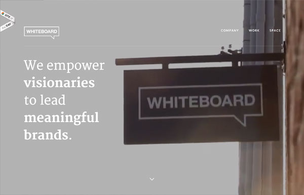
Whiteboard
The background's blurry effect is particularly stunning on the Whiteboard site. To see it yourself: narrow your browser to mobile breakpoint or check it on a mobile device and click on the menu icon, the background will be transformed with the blur effect.
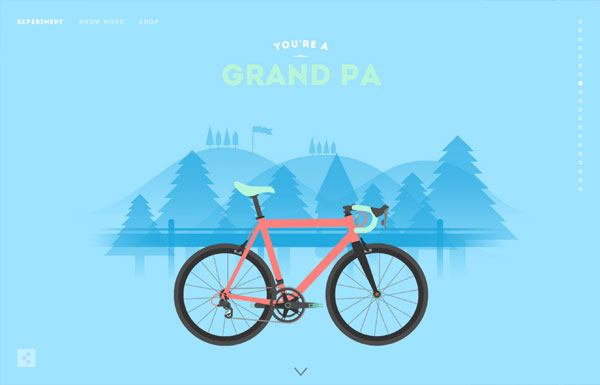
Cyclemon
Simply beautiful illustrations presented with parallax scrolling! Check out the Parallax theme if you like parallax scrolling effect.
Mahedine Yahia
The main background animation on Mahedine's site consists of 191 images (each image is about 56kb file size, 470 x 264px). It produces frame-by-frame animation effect as you scroll.

Life of Pi
The Life of Pi jorney site has taken parallax scrolling and frame-by-frame animation to another level. If you like the movie, you will definitely enjoy scrolling on their site. It shows you behind the scene materials in frame-by-frame animation as you scroll. The result is breath-taking with just over 100 images with heavy Javascript and CSS3 work.

Teehan+Lax
Each story (post) on Teehan+Lax is beautifully crafted with great attention to details. The content is presented with beautiful typesetting and subtle animation effects (eg. check these two posts). In case you are not aware of this minor UX detail: when you are at the middle of the page, notice the top nav bar slides down when you scroll up and it slides up again when you scroll down. The logic makes perfect sense. When you scroll down, you probably want to continue to read, so you don't want the nav bar to obstruct your reading area. When you scroll up, the nav bar appears in case you want to jump to another page.

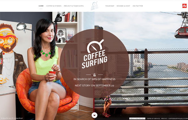
Coffee Surfing illy
The page transition on Coffee Surfing illy site is not as seamless as the Bienville Capital Management site as mentioned above, but the half page scrolling is interesting. When you scroll, the page is divided in half and scroll in opposite direction.
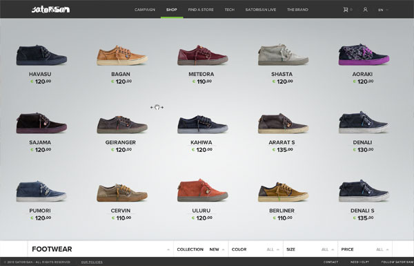
Satorisan
Satorisan has a very nice shop design. The shop main page allows you to view all products in a scrollable/draggable horizontal list. Clicking on any product will transit to the product detail page with parallax scrolling effect.
Wink TTD
Wink did an awesome job on their responsive and interactive website. Whether you are viewing the site on a large iMac screen or a tiny iPhone display, the design and animation is very consistent.
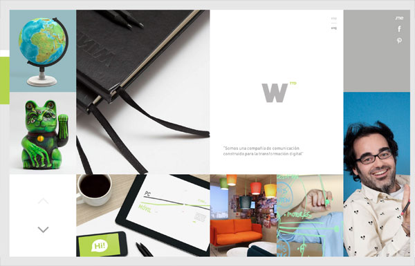
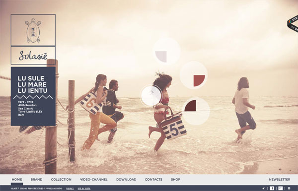
Solasie
From design to interaction, the Solasie site is two thumbs up. It was pleasant browsing on the site to enjoy the rich media content (gallery images, music, and videos). The only problem is the SEO and accessibilty issue. The content is not indexable and the page URLs can not be shared because the pages are queried with Ajax. This is a common problem with sites relying on Ajax to display the content, but they often provide anchor tags in the URL bar for sharing pages.
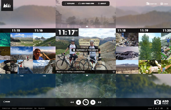
REI 1440 Project
The timeline presentation on the REI 1440 site is very suitable for their concept, "minute-by-minute" timeline making up a 24-hour period. You can use the arrow keys to navigate through the timeline which saves time from moving your mouse and clicking. Try out their clock time selector — from design concept to technical execution, all were done excellently!
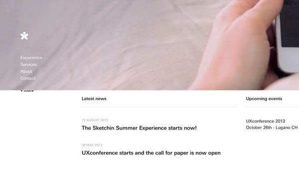
Sketchin
The text masking on the navigation menu is a nice touch to the site.
Anonymous
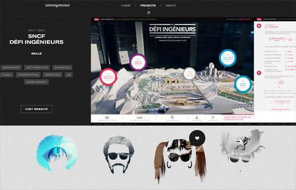
Anonymous agency not only makes good design, but they present their portfolio well. The portfolio images were masked with silhouette of faces — very cute! The portfolio expander might seem like it is pulled with Ajax, but they are actually separate pages. Also, notice the tiny detail of the year bubble tooltip as you scroll through the portfolio items?
Beatbox Academy
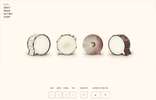
The Beatbox Academy lets you create drum beats by hitting certain keys on your keyboard. It doen't really serve any other purposes (you can not save or export the beats), but it is fun. The parallax scrolling on the site is nicely done though.
Quartz
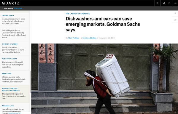
Quartz puts the center focus on the content. Unlike most news/editorial sites where they force you to click on the article to read full story, Quartz displays all articles with full content on one page. As you scroll through the articles, the address bar automatically updates the URL (good for sharing articles). Their mobile breakpoint provides the same browsing experience as on the desktop.
Evans Halshaw - Bond Cars
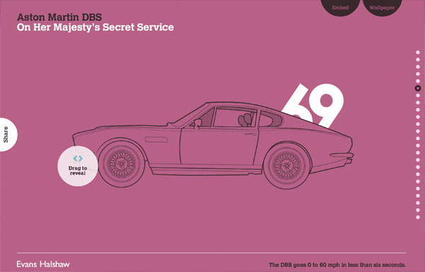
If you are a parallax scrolling lover, this Bond Cars site by Evens Halshaw is a must see.
Zurb Manifesto
Another parallax scrolling site.
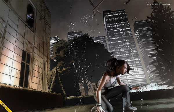
Peugeot Hybrid4
If you think the above parallax scrolling sites are cool, wait until you see the Peugeot Hybrid4 site below — nice illustrations, keyframe animation, awesome sound effects, and great transition. Don't forget to turn on your speakers while checking the site.
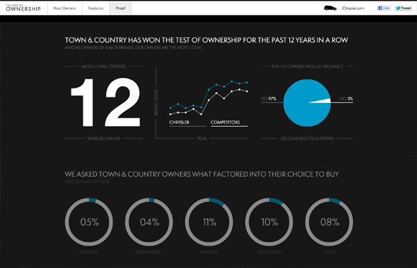
Chrysler: Test of Ownership
Chrysler's Test of Ownership site is another good example of page transition. The page layout/content transits nicely when switching different pages. Not to mention the beautiful animation on the Proof page. Scrolling down will animate the numbers, charts, and bars. Scrolling up will reverse the animation. Simple, but cool.
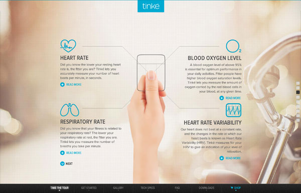
Tinke
As you scroll on the Tinke site, it shows you a complete walk-through of the product, all in action! Unfortunately, it is not responsive.
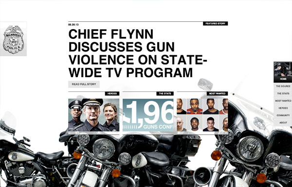
Milwaukee Police News
Have you seen a police site this cool with Ajax and parallax scrolling?
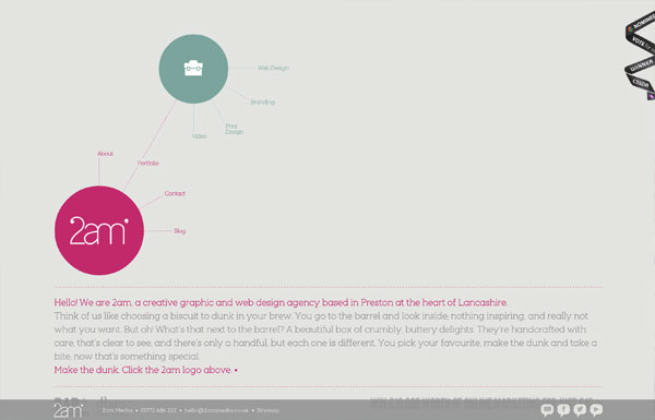
2am Media
Although the tree branch styled menu on the 2am Media site reminds of the old school Flash sites, but it is incredible with Javascript!
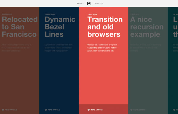
Minimal Monkey
Minimal Monkey is a simple site by Stephen Burgess which offers great user experience. The layout, page transition, and navigation are very well thought-out on all responsive breakpoints.
Athenos
Athenos is a lovely site with a lot of design details and transition effects. It has also proven that modern sites are heavy on page load. Just this animated GIF file on the site is 2.5mb. Beauty does come with file size!

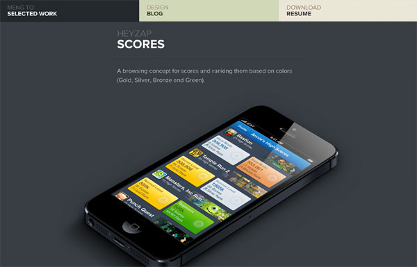
Meng To
Meng To presents his works nicely with big bold images and fly-in animation.
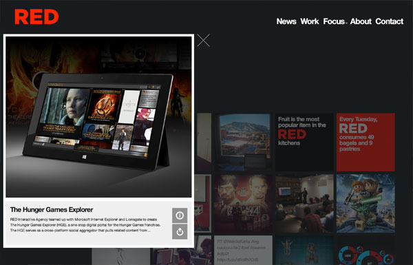
RED
The RED agency site is full of design details and animation effects. Be sure to click around the site.
Carbon Studio
If you miss the old-school Flash sites with drag and drop navigation, check out the Carbon Studio site.

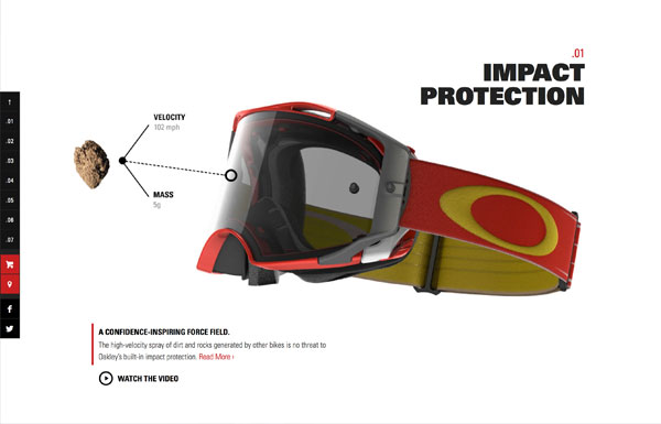
Oakley Airbrake MX
The Oakley Airbrake MX site is another crazy example of parallax scrolling. The product tour is visually stunning!
Nick Jones
Nick Jones's site might be outdated, but the interaction design is still very good.
More...
Most of these sites are found on Best Web Gallery. Thanks to Chad Mueller for managing and collecting inspirational sites on Best Web Gallery. Check out Best Web Gallery for more sites.
source: http://webdesignerwall.com/trends/30-great-interactive-sites


No comments:
Post a Comment